However as Tim had never used Photoshop, I helped him out and gave him shortcuts and explained how to use the programme. This was also the case for a couple of other students in my class.
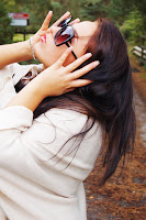
The Final photos I chose to put on my front cover, back cover and tour advertisement are:
ORIGINAL -

MY EDIT -

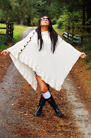
SECOND ORIGINAL PHOTO -

MY EDIT 2 -

TOUR POSTER ORIGINAL PHOTO -

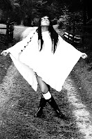
MY EDIT 3 -

I followed the theme of black and white throughout my promotion and digi-pak to link them with each other. This is also very common in professional digi-packs.
No comments:
Post a Comment